|
-
25th February 10, 07:41 PM
#1
 A Little Help If You Please. A Little Help If You Please.
I have attempted to join the interweb community to market my unique line of accessories. Not being very "net" savvy, I would appreciate your input as to the site's current form and content.
Due to the hosts frugal charges, I do have limits but all suggestions will be considered.
There is a "Testimonial" page so if you have purchased from me, please feel free to post your thoughts.
In the spirit of our forum, I will compile a list of names of those who post to this thread by March 1 and draw one name to receive a "Thank You" gift from me.
http://bigmikeyoriginals.webs.com/
You can also find a link in my signature line.
Gentleman of Substance
-
-
25th February 10, 07:48 PM
#2
The only suggestion I have is to make the thumbnails under "Featured Products" just a bit bigger. The rest of the site looks nice to me.
--dbh
When given a choice, most people will choose.
-
-
25th February 10, 08:25 PM
#3
Bigger photos, Mike -- much bigger. And a Scottish castle with a hose-top, like Craigievar:
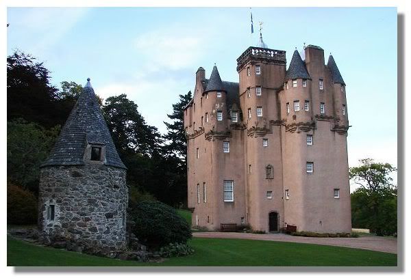
cropped to suit, of course.
-
-
26th February 10, 05:44 AM
#4
I second Rex's comment about larger pictures. On the home and about us page, wrap the text around the pictures, the current white space beside the picture is distracting.
On your Hose Topper page it looks like you only have three tops available. I know that is not the case, but it is hard for anyone new to the site to see that the color options are much wider. I would suggest showing color swatches and topper styles and let the customer make their own selection. Select style # then list colors in sequence to complete the order.
Brian
In a democracy it's your vote that counts; in feudalism, it's your Count that votes.
-
-
26th February 10, 06:53 AM
#5
Tartan Beanies? - Is there a reason there's a '?' there?
Aside from the '?', my comment would be to change it to 'beanies to match your tartan' instead of calling them tartan beanies, as they're not tartan per se... they're striped beanies.
Kilt pins... is there a way to pick which one you want (a dropdown menu)? What about the 'shape' of the stone... square, triangular, round, etc...
I note that on the Pricing page, you say to NOT use the shopping cart on the site... why is that? Also, MOST people would overlook that note and use the shopping cart (b/c that's what we're trained to do when shopping online... look for the 'add to cart' button). You may want to see if there's a setting to 'disable' the add to cart button or have a 'call / email for pricing' option to have everyone contact you for the sale.
Aside from the 'form' on the 'contact us' page, include a phone # (with 'hours' to call if it's your home phone) and your email address and perhaps a PO box or your address. I never shop anywhere online that doesn't have a physical address and multiple ways to contact them in case something goes wrong. I also often call them and ask a question (no matter how small) to test their CS skills BEFORE placing my order.
Just my $.02. Overall, I'd say you're off to a VERY good start and from someone who used XMARKS members to quality check my site, let me say that we have some VERY observant and meticulous people up here. 
Last edited by RockyR; 26th February 10 at 06:59 AM.
-
-
26th February 10, 07:07 AM
#6
Mike,
I remember when you posted those toppers. I still think they are great. Good for you on the new web site.
I agree that the picture settings/properties need to be set to allow the text to be next to the pictures. And that your picture on the home page should be larger
On the home page next to or below the current picture of the hose being worn put a picture of a pair of hose with one on your toppers laying across it, not worn. This will allow the visitor to quickly/visually understand what it is you are offering them. Unbold the text on the body of the Home page. Bold should be used to draw attention and make something POP, not for size.
The top of each page should have the company name (I assume Big Mikey Originals) in a larger pt, meaning bigger size and possible a different font style that the company descriptions..."Unique Kilt Accessories For The Modern And Traditional Kilt Wearer"
I would change the category of pricing to exchange
Add a category heading called "custom" or "special order" or something like that. I know in the item descriptions you state that they can come in a variety of colors but this link can give you a page to give details about that.
On the toppers page there is too much space top to bottom. The text either enned to go more horizontal or put on other pages. Other pages could be ..."how are they made" ..."Where did they come from/Origins"...."Custom Order"..."Why Buy"
On the links page change the picture, if possible, to an image of their logo. For example the freedom link you see on Xmarks vs a page image
Keep the font size and style consistent on the item pages. The pins is different form the rest. Also have the title larger than the description. Don't just do bold vs unbold to create the contrast. Look to the Kilt pin page to see what I mean, I like the look of that page.
The kilt pins page need to have a way to see a close up of each different option. You could just put an image of each of the badges available. It could be a group shot of the badges or each one separate. If they are separate images you could have each linked to a description of what it is/meaning/symbolism/significance ect....
Hope that this information is helpful.
-
-
26th February 10, 07:39 AM
#7
The header is too large; you must scroll down to find more info. You can loos costumers that way. You should make the font slightly smaller and adding images into the text instead of above and instead of the "Featured products” section. You have the menu under the header that should be sufficient to find your products. You can also create links to the images that lead customers to product pages. You should also advertise on the home page that you accept Paypal. This is important information especially for international customers. It can also be a good idea to specify the prices as CAD on product pages so the customers immediately know what currency you are dealing in.
Other than that I think the website has a nice layout and good colours.
[U]Oddern[/U]
Kilted Norwegian
[URL="http://www.kilt.no"]www.kilt.no[/URL]
[URL="http://www.tartan.no"]www.tartan.no[/URL]
[URL="http://www.facebook.no/people/Oddern-Norse/100000438724036"]Facebook[/URL]
-
-
26th February 10, 08:26 AM
#8
Hi Mikey,
The site looks good so far. I'm familiar with Webs as it's the same company I use for my site. I preferred altering an existing template rather than starting from scratch. Here are my suggestions:
1) I'll echo ThistleDown and suggest a different castle picture. Perhaps a Scottish-Canadian castle like Dundurn Castle? You could also change the background image as well.
2) Ditch the Webs shopping cart and set up your own PayPal Canada business account. It's free to set up and the charges are based per transaction. You can make you own 'Add to Cart' buttons in their Button Factory and paste the code onto your own site. The only thing that sucks about PayPal Canada is that there isn't really any way to set up discounts and the Shipping Calculator is awful. But it's better than the Webs cart.
3) Set up a Photobucket Account and use larger thumbnails on your site which link to bigger pictures.
Other than that, it looks like you're off to good start, Mikey!
[B][COLOR="DarkGreen"]John Hart[/COLOR]
Owner/Kiltmaker - Keltoi
-
-
26th February 10, 09:18 AM
#9
Mike,
I can offer nothing additional other than what has already been mentioned. I will gladly test the "Feedback" section as soon as I get my Toppers. 
-
-
26th February 10, 02:03 PM
#10
Thank you all for your suggestions thus far. I will have my daughter try to help me implement some of these things to improve what we have. Your words of encouragement are greatly appreciated.
Gentleman of Substance
-
 Posting Permissions
- You may not post new threads
- You may not post replies
- You may not post attachments
- You may not edit your posts
-
Forum Rules
|
|


Bookmarks