|
-
16th October 10, 05:14 PM
#1
A new tartan design
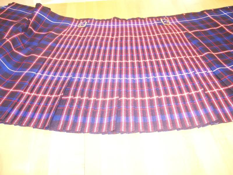
So I'm not Scottish, but I would really like to have a family tartan. My wife and I have been screwing around on Scotweb and came up with the following and I'd like your input.

I printed it out and held it up so my wife could see how it'd look on me, she said it looked great. I then asked how she would look in a matching skirt. To which she replied "It'll be far enough away from my face that it will look fine."  I seriously almost peed I laughed so hard. Of course she didn't mean it as it sounded. Funny just the same. I seriously almost peed I laughed so hard. Of course she didn't mean it as it sounded. Funny just the same.
-
-
17th October 10, 12:13 AM
#2
This is far too pale with no variation in the tone of the various shades for my liking. It breaks all the traditional colour balancing techniques and I don't believe will look good out doors. I think you should go back to your colour palette.
Last edited by figheadair; 17th October 10 at 05:23 AM.
-
-
17th October 10, 01:15 AM
#3
I concur. It will look a lot like a faded flannel shirt, which will do fine if you really want a subdued hunting tartan. It's not really bad, it just doesn't "pop."
It's tour tartan so you can make it what you want, but I would advise going from gray to a blue-gray color, but not such a subdued one, and get a little more contrast in the smaller stripes, maybe brighten them up a bit as well, but the tan "base" could work well and would be a nice departure from the hum-drum green and blue based tartans.
I really like the design, just not the color choices. I wouldn't change the thread counts unless you just want to tweak the sett.
The grass is greener on the other side of the fence...and it's usually greenest right above the septic tank.
Allen
-
-
17th October 10, 06:48 AM
#4
Looks OK so far but could look better with a bit of tweaking 
The faded look to the colours could be thought of as an "ancient" or "weathered" version of the sett. Maybe try a "modern" version with deeper, more vibrant shades of the same colours?
In terms of thread count, I think it would balance the design by taking the blue line one the outside of the darkest stripe and making it thicker. Sitting so close to another stripe of the same width makes it look a bit too static...
- Justitia et fortitudo invincibilia sunt
- An t'arm breac dearg
-
-
17th October 10, 06:51 AM
#5
Excellent points, thank you.
-
-
17th October 10, 10:27 AM
#6
I like it. Of course I've been accused of being a fairly tame dresser, even in the kilted world.
You might consider inserting a few bright lines (white, yellow, red,...) into one of the areas. This would give you some other options in pleating style as well adding some vibrancy to the tartan.
-
-
17th October 10, 12:01 PM
#7
Here's the revision of the same set with some white added.

Last edited by G_W; 17th October 10 at 02:49 PM.
-
-
17th October 10, 11:23 AM
#8
The previous revision I was working on had 2 threads of white on either side of the central blue. I also have a version that has gold and green in it, along with a lot less blue. The wife's taste in colors are what prompted this current design.
Some of the issue is with my tastes I'm sure, I'm a fairly mellow dresser as well. I prefer earth tones and blues. I'm not one for many garish or clashing colors as I'm color blind red-green. It may also have to do with my mindset. I work in the metal working industry and my way of thinking is very linear if that makes any sense. I also wonder if some of it has to do with using the Scotweb site. The colors seem a bit muted compared to what I am used to. I'm not sure if that's because they are a better representation of how it will actually look, or maybe the brighter colors are more specialty colors.
I'll post that previous revision in a bit.
I'm very new to this, and I want to jump in with both feet. Please don't worry about what I know, because it's really not much. So keep that in mind when reviewing my work. If you have some recommended reading on design, I'd love to know what it is. I'm not willfully ignorant, rather, ignorant with a desire to change.
-
-
17th October 10, 12:48 PM
#9
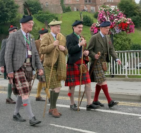
I think both versions look wonderful. To me, they look a lot like many of the older tartans I grew up with and don't seem out of place at all. It reminds me very much of The Very Rev Allan MacLean of Dochgarroch's Kilt in this picture.

(I cannot recall who we have to thank for this picture.)
-
-
17th October 10, 01:33 PM
#10
Just keep playing with it until you get the right mix that you are happy with. That's a big part of the fun and satisfaction once you get it done.
When I first saw your it made me think of the Ulster Tartan. They use a brighter yellow and the red creates a nice "highlight" in the sett.

Keep in mind also the color variations between monitors. The same yellow can look very different depending on the monitor.
While you design it, make a few mock ups of how it would look pleated in different ways.
Here are two kilts of the same tartan pleated to the same red stripe but one is a 4 yard box pleat and the other is an 8 yard knife pleat...http://giftshop.scottishtartans.org/kiltpage.html
When pleating a kilt to the stripe, it is a nice effect to have a "bright" stripe to use. Here's a kilt pleated to the white stripe but you can see how dark the actual tartan is by the un-pleated sections. The pleats end up looking very bright across the back.

I wear Fraser Hunting, which is a fairly dark tartan depending on the mill weaving it
(This is probably not the best example given your color blindness, sorry.)

Pleated to the White Stripe

-
Similar Threads
-
By Mindrop in forum The Tartan Place
Replies: 17
Last Post: 28th July 10, 01:42 PM
-
By Mark Keeney in forum The Tartan Place
Replies: 11
Last Post: 15th September 06, 11:08 AM
 Posting Permissions
- You may not post new threads
- You may not post replies
- You may not post attachments
- You may not edit your posts
-
Forum Rules
|
|
I seriously almost peed I laughed so hard. Of course she didn't mean it as it sounded. Funny just the same.


Bookmarks