|
-
Cornish tartan concepts
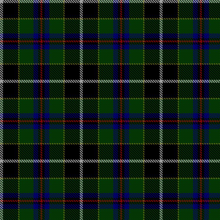
Yes there's already a "Cornish National" tartan... I think it is hideous. De gustibus non est disputandum.
Here it is in all its glory:

To my eye it looks even worse when made up into a kilt, if you can imagine it.
Now, what does the would-be designer of a "Cornish tartan" have to work with? The two symbols are the flag of Saint Piran, a white cross on a black flag:

and the "bezants", fifteen gold circles often (but not always) arranged on a black shield:

Due to the nature of tartan the bezants must become squares, and the number must decrease to 9 or increase to 16. The St Pirin flag, why, tartan design is all over that one.
Seeing that the shield is black, and the flag is black, I drew up an all-black tartan with four yellow lines and one fat white stripe. It was awful.
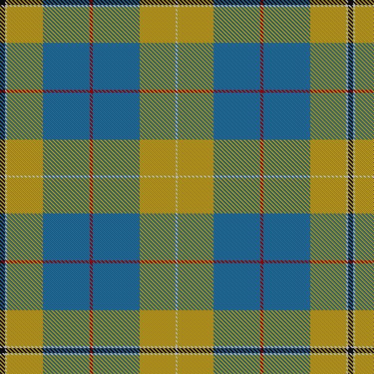
I realised that the black background of the bezants and the black flag needed to be set off by a background of some sort. Well, Cornwall is surrouned by the sea and sky so why not a nice bright blue? Here's the result:

That looks a bit stark, a bit diagrammatic to me, so I tried introducing a motif to break up the big blue area. Here's what it looks like, rendered in various hues:


What do you all think? Best to have the stark simple one? Or if the extra stripes are added, which looks best? Thanks!
-
-
I kind of like the stark simple one myself. Maybe play with the spacing on it.
INCREASE the blue section by 100% and DECREASE the white and black by 50%.
Try the opposite as well... increase the black and (not necessarily the white) and decrease the blue and black / gold. Try just using 1 color for the gold (stripes about 4 threads wide and black sections between about the same), not 2.
-
-
Thanks, I'll try those things.
I did play around with the width of the blue area in the top design, and less or more blue didn't look good to me. Where I have it there is where it seemed to "balance" for my eye.
About the gold stripes: I tried yellow and "old gold" and neither looked very "gold", so I went with three narrow stripes old gold/yellow/old gold. I really like the golden look it gets.
-
-
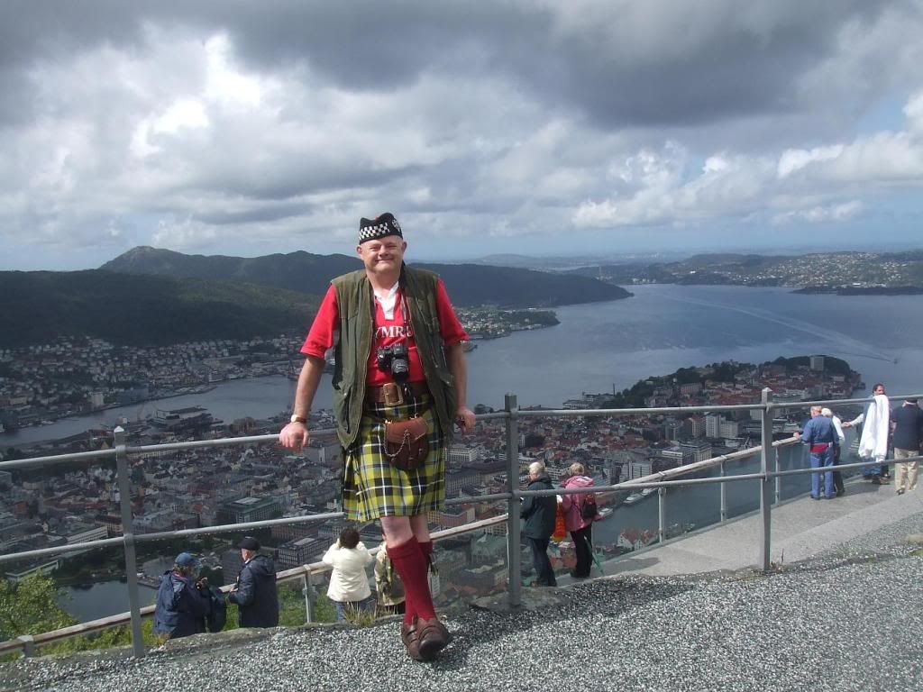
Some of us happen to like the Cornish National tartan! 
And here is a photo of me modelling it in Bergen, Norway - they liked it too!

[B][COLOR="Red"][SIZE="1"]Reverend Earl Trefor the Sublunary of Kesslington under Ox, Venerable Lord Trefor the Unhyphenated of Much Bottom, Sir Trefor the Corpulent of Leighton in the Bucket, Viscount Mcclef the Portable of Kirkby Overblow.
Cymru, Yr Alban, Iwerddon, Cernyw, Ynys Manau a Lydaw am byth! Yng Nghiltiau Ynghyd!
(Wales, Scotland, Ireland, Cornwall, Isle of Man and Brittany forever - united in the Kilts!)[/SIZE][/COLOR][/B]
-
-
Don't forget there is the Cornish National Hunting.

The Cornish National Day tartan.

As well as the St. Piran Cornish Flag tartan.

-
-
Solid black kilts are also supposed to represet Cornwall, FWIW. Mind you, lots of people also wear them without that intent. I even have one myself, and am not Cornish.
ETA: They do have the advantage that they can be obtained all sorts of places.
-
-
Thanks for posting those Matt.
I've seen them all, I suppose, over the years, and I didn't like any of them.
They make me more motivated than ever to design a Cornish tartan that represents Cornwall but is also an attractive design.
None of them really tackle the bezant thing. Maybe I'm wrong, but I think it's possible to devise a tartan that has the St Piran flag, and the bezants, and at the same time is fairly attractive.
I actually had a computer printout of my first design, seen at the very top here, which I showed to several people at the international gathering of the Cornish American Heritage Society at Mars Hill a few years ago. Everyone seemed to like it. One guy asked for a copy of the printout; he said he was going to pursue getting it woven. I never heard if he did.
Anyhow I think the design of mine that works best is this one:

because the lavendar tones down the yellow a bit. I'll play a bit with the proportions, and try going from 9 back up to 16 bezants, and look into getting it woven.
Last edited by OC Richard; 30th May 10 at 05:41 AM.
-
-
Of all the designs you've presented, the one you rejected as stark, and a bit diagrammatic is the one most pleasing to my eye.
-
-
Now that I'm at my computer, here's what I was talking about by increasing the black and decreasing the blue:

-
-
31st May 10, 04:44 AM
#10
That's a pleasant design for sure Rocky, but it's different from what I had in mind: have the two symbols of Cornwall, the St Piran Flag and the black shield with gold bezants, both shown more or less equally upon a contrasting azure field or ground.
In your design the black of the St Piran Flag is becoming the ground of the tartan, and the azure is seen (by my eye at least) as azure stripes upon the black ground.
The reason I'm fiddling with adding other stuff on that azure ground is purely artistic: there's too great a contrast design/proportion-wise between the one fat white stripe and the four narrow gold stripes. Note that the purple motif is halfway between these two extremes, serving as a visual bridge, or in other words a median or mean, having two stripes.
The trick is to have the contrast of this added motif be low enough so that it blends with the azure and becomes part of the ground, allowing the St Piran and Bezant motifs to stand out. At the same time it helps subdue the harshness of the black/white and black/gold portions.
Anyhow I put the number of bezants back to 16, and made a different portion of the design show (previously the St Piran motif was shoved to the side, distorting the intent).
I'm liking this approach more, with the more subtle added purple motif:

Here there's more contrast, demonstrating the catch: the more contrast the purple has the more it helps smooth over the stark/harsh bits, but if too contrasty the purple bit begins to look like a motif in its own right, struggling for attention/dominance with the other motifs. If there were more colour choices in that program I could find the ideal medium ground. As it is, the version below is just a bit too contrasty I think:

You may notice that I tend to favour what DC Stewart calls the "attenuated" feel of many early tartans over against the bulky, blocky, crowded proportions of many modern ones.
Here's a compromise between the simple tartan at top (having the two motifs only, on a plain azure ground) and the more complex/busy ones...

Last edited by OC Richard; 31st May 10 at 06:01 AM.
-
Similar Threads
-
By Big Homestead in forum General Kilt Talk
Replies: 38
Last Post: 2nd October 07, 09:05 PM
-
By emeraldfalconoflight in forum General Kilt Talk
Replies: 9
Last Post: 26th January 07, 06:29 AM
-
By Graham in forum Show us your pics
Replies: 23
Last Post: 3rd November 06, 12:39 PM
 Posting Permissions
- You may not post new threads
- You may not post replies
- You may not post attachments
- You may not edit your posts
-
Forum Rules
|
|


Bookmarks