|
-
5th August 11, 07:22 AM
#1
Potential Family Tartan Critique
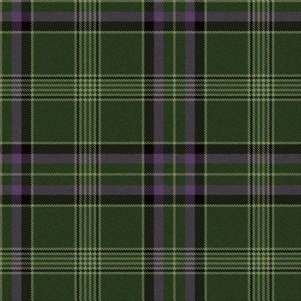
Have been having a go at designing my own tartan. I know its a bit of a cliche but its predominantly green and purple for the hills and the heather, but I have also included 5 lighter stripes to represent my extended family and 2 black lines to represent Black Taylor of the Lochaber axe, which is a variation on a theme incorporated into the Taylor Ancient tartan which is my family tartan. Any critique most welcome. Do you think it would work or how could I improve it. I know its not as garish as some modern designs but I quite like the understated appearance.

regards
Simon
-
-
6th August 11, 06:49 AM
#2
Rev'd Father Bill White: Mostly retired Parish Priest & former Elementary Headmaster. Lover of God, dogs, most people, joy, tradition, humour & clarity. Legion Padre, theologian, teacher, philosopher, linguist, encourager of hearts & souls & a firm believer in dignity, decency, & duty. A proud Canadian Sinclair with solid Welsh and other heritage.
-
-
6th August 11, 07:23 AM
#3
I quite like the colours!
Design-wise, I think you could do some tweaking on the line widths to have a greater variety of sizes. This will help it to look more like tartan and less geometric.
On the central strip, vary the sizes of the black, purple, and green bands. Also slightly increase the size of the light green that frames this section to differentiate it from background stripe.
The background stripe is an interesting effect (many thin lines together). You might try taking out just one of the thin light green ones to make it a bit less dense and to tip the visual balance more towards the purple/black section
- Justitia et fortitudo invincibilia sunt
- An t'arm breac dearg
-
-
6th August 11, 07:49 AM
#4
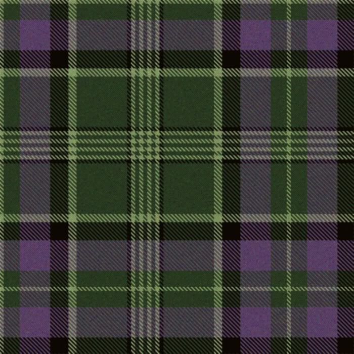
Thanks for your views I have tweaked the design along your suggested route, A subtle difference but accentuating the purple. Is it any better?

Kind regards
Simon
-
-
6th August 11, 07:55 AM
#5
That does look better... to me anyway 
The only problem is that the changes compressed the design a bit. I think it needs to have the dark green background (flanking the bunch of thin stripes) enlarged to give it more of a sense of space...
- Justitia et fortitudo invincibilia sunt
- An t'arm breac dearg
-
-
6th August 11, 08:05 AM
#6
thanks again, I tend to agree with you that I think it looks better with a greater proportion of purple. If I expand the dark green section flanking the lighter green stripes then I would have to reduce either the purple or the black to keep within the recommended maximum of an 8" set. Its a bit of a trade off but I can completely understand where you are coming from. I will continue to play with the proportions.
Kind regards
Simon
-
-
6th August 11, 08:33 AM
#7
' Looks really great to me as is, but then it's your own opinion and happiness with it that really counts in the end.
-
-
6th August 11, 09:23 AM
#8
Nice work!
The single most important discovery I made while developing a tartan was the issue of scale. Initially, I had based my plan on the Matheson tartan, which has a really large sett. Until it was pointed out to me, I hadn't noticed that the pleats of my ancient hunting Matheson kilt were different depths in order to create the perfect balanced look it has. That takes a bit of skill on the part of the kiltmaker.
Therefore, I reduced the scale considerably, and ended up with a tartan more like the Gordon (the other influence I wanted to include). I'm quite pleased with the result.
Another aspect is the exact thread colour*. I left that aspect in the capable hands of the weaver, Gordon Kirkbright {of Fraser & Kirkbright Weaving in Vancouver BC} whose choices absolutely blew me away. There's nothing quite like experience and skill to bring out the best in a tartan!
It's an expensive proposition to design, register and weave your own tartan, but with good planning and good advice, it's an enriching and rewarding experience.
* the avatar in the corner doesn't do it justice. Check out Lady Chrstel's site, and you can see the Stephen Mathieson tartan in its actual colours.
EPITAPH: Decades from now, no one will know what my bank balance looked like, it won't matter to anyone what kind of car I drove, nor will anyone care what sort of house I lived in. But the world will be a different place, because I did something so mind bafflingly eccentric that my ruins have become a tourist attraction.
-
-
6th August 11, 09:04 AM
#9
I really like it, and the colours are among my favourites-well done man! I like earth tones, one of the reasons for my preference for hunting kilt attire, and even my regular (non-kilt) clothes tend towards earth tones in tweed, wool, and corduroy.
-
-
6th August 11, 09:21 AM
#10
thank you, just to clarify which one do you prefer the original or the tweaked version. I quite like them both now. Doh!
-
Similar Threads
-
By R.S.L. Kiltwearer in forum The Tartan Place
Replies: 9
Last Post: 18th July 11, 03:54 PM
-
By HamishTheBlack in forum The Tartan Place
Replies: 14
Last Post: 29th January 10, 12:09 AM
-
By canawler in forum General Kilt Talk
Replies: 10
Last Post: 10th October 07, 10:16 AM
-
By Wompet in forum The Tartan Place
Replies: 34
Last Post: 3rd October 06, 07:01 PM
-
By Big Dave in forum Kilt Advice
Replies: 3
Last Post: 1st April 05, 11:59 AM
 Posting Permissions
- You may not post new threads
- You may not post replies
- You may not post attachments
- You may not edit your posts
-
Forum Rules
|
|


Bookmarks