|
-
5th April 14, 09:41 AM
#1
Thinking about this again this morning. I'm emailing the Army Institute of Heraldry to ask if they can give me a definition of the correct shades of Army blue and gold using the RGB color scheme so I can create them exactly on a computer screen. Failing that, I could go to Marlow White, the uniform maker over in Leavenworth, and get samples of the cloth used in making uniforms that strictly meet standards. Is there a simple way to scan such samples into a computer and get the RGB numbers as a result? It's been a very long time since I've done any web design, or done any print design using a color wheel. I've forgotten more than I ever knew. I could use some help getting the correct colors to display in a proposed Army tartan like OCRichard posted above. Thanks, Rabble.
-
-
5th April 14, 05:06 PM
#2
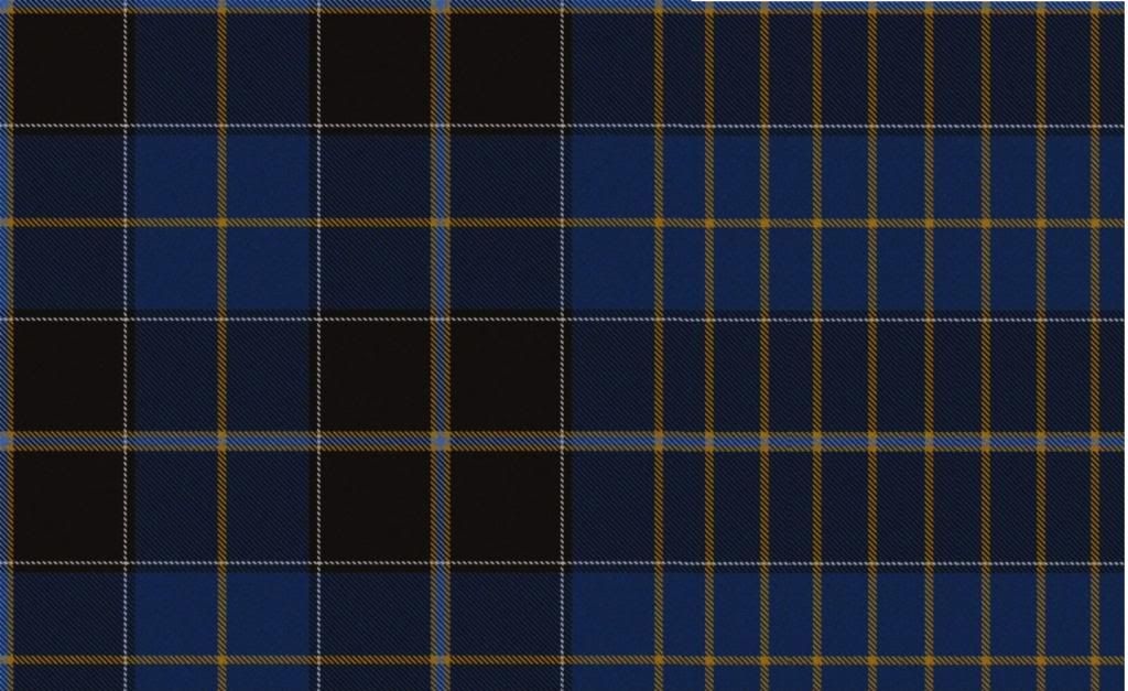
What about this one. I added the white, Infantry blue and changed the proportions of the blue/black. like you recommended.....
http://www.scotweb.co.uk/tartandesign/details/64384
Somebody ought to.
-
-
6th April 14, 01:49 AM
#3
-
-
6th April 14, 05:45 AM
#4
 Originally Posted by Guinness>water

Here it is so we can all see it, I hope you don't mind. I really like your design! Though to me the blue area seems a bit compressed or choked... perhaps if it were given a bit more room to breathe?

Wizard, I myself would alter the proportions slightly of both your tartans
1) in the Marine tartan the dark blue area is being overpowered a bit by the white/gold area; I would increase the width of the dark blue area slightly, and try to create more balance (a quite subtle shift is all that's required)
2) in the Army tartan the background colours are approaching 50/50 which can make a tartan look blocky and static; as you can see the base of your Marine tartan (closer to The Golden Ratio as it is) is stronger. I also would have changed that white line to gold, as per the jacket's cuff.
Time for me to put up or shut up! So here goes, a new attempt, for what it's worth. I added black mainly because it needed 'something' in that dark blue.
Here's Infantry, with the gold border

Artillery... no matter what red I tried, and I tried five or six of them, it either looked to pinkish or too orange, so apologies in advance to you Artillerymen out there

Military Police... there's your green! Branches with two colors work great, the other color can take the place of the gold border

and Medical Corps

Last edited by OC Richard; 6th April 14 at 06:45 AM.
Proud Mountaineer from the Highlands of West Virginia; son of the Revolution and Civil War; first Europeans on the Guyandotte
-
-
6th April 14, 01:07 PM
#5
Your comments are interesting and appreciated Richard although the USMC Dress Blue Tartan cannot be changed at this date. It is already registered, fabric woven, and kilts made from this design.
The reason behind these two designs is based not only on how these look as a square on the screen but how they look when made into kilts with various pleating choices.
The USMC, when pleated to the Red stripe is very reminiscent of the full uniform. The lighter blue really looks like the trousers.
And the white accent look like the waistbelt and cover.

Some people do not like blocks of color like my designs but others, myself included. do. I sized the elements in the same ratio as that found in the uniform itself so it sort of had to have the two blues in that ratio.
I of course look at Tartan as a Kiltmaker would. I imagine it laid out on a table, as I try to figure out how to pleat it. I look at Sett size and the width of the individual elements. In general fewer, larger, simplier elements pleat up much better than a lot of small elements.
As I tend to pleat military inspired Tartans to the Stripe I would usually pleat this Army Tartan to the Gold stripe within the lighter blue.
This would mean that the white and branch distinctive parts would be seen in the front apron and far less in the back of the kilt.
I ran some numbers and if I were commissioned to have this woven I would request five different runs.
The first four would have the branch colors of the four largest branches.
Infantry Blue for Infantry
Yellow for Armor and Cav
Scarlet for Artillery and ADA
And Ultamarine Blue for Aviation.
I would then have the fifth run of 4 times more yardage done with a fifth, more neutral branch stripe such as MSC.
When someone were to order fabric for a kilt they would get 3 yards d/w for the pleats and 1yard d/w for the aprons in their choice of branch.
This would actually be a very cost effective way to have this Tartan woven.
Four runs of 14yards and one of 64 yards. Very easily done.
My submission is quite different from some of the others submitted so far. I am using the current ASU Army uniform and not the Dress Blue or Green Class A used during my time. So I do not have any green in my designs.
the two colors used in the current ASU uniform are actually quite close to each other. Army shade 450 for the blouse and Army shade 452 for the trousers. I included the gold stripe within the lighter blue to represent the gold stripe of the NCO and Officer trousers.
The White in my design is for the shirt. To my eye this design was quite dark and needed an accent stripe to catch the eye.
In my design there actually are black guards to the branch stripe and between the White and Lighter Blue.
So yes, my submissions are quite different from some of the others. I think that was the goal of the OP. to see if something different could be done that would represent what he sees and thinks of when he sees US Army attached to a design.
So I offer these only as submissions. The decision will be in the eye of the OP. If he likes mine he is welcome to them free of charge. If not he is free to choose any other design he prefers better.
Last edited by Steve Ashton; 6th April 14 at 02:42 PM.
-
The Following User Says 'Aye' to Steve Ashton For This Useful Post:
-
6th April 14, 06:09 PM
#6
Man, you guys are really cranking out some great ideas. I probably should stop messing around and follow your leads.
Guiness, I love your design. I see you chose privet as the olive shade. I'd been playing with that one too. You're choice for khaki is excellent. That Infantry blue sure tickles my fancy.
I'm really liking the various proposed tartans based on the dress uniform, too. Could there be an Army Modern Dress tartan that's predominately blue, and an Army hunting tartan based on the olive? Hunting really isn't an official Army mission, but patrolling is. Maybe we could have an Army Dress and an Army Patrolling tartan. How about that that?
Steve's designs are fantastic. Very dressy. I really appreciate knowing how the tartan would pleat. As I've toyed with designs I've wondered how they might pleat. A kilt making master should know far better than I. I like the way branch colors can be worked in. The Scotweb tartan designer tells me thread count, but I have no idea how that converts to inches and pleatability.
OCRichard, your designs are impressive. I do like the touch of black running through the dark blue. I have no idea how much of a new Army tartan would ever sell, but I think giving the buyer an option of having branch colors woven in is a big plus. You displayed the option very well.
Having just read Steve's last post, I understand his designs even better. I'm not sure I understand the idea behind the amounts that might be ordered, conceivably, I'm going to have to reread that and try to imagine how a kilt is made. I appreciate you making you designs freely available, Steve.
I'm getting the itch. The tartan designs keep saying to me buy, buy, buy! However, a new kilt is going to have to wait. I want to lose a few more inches before committing to anything of higher quality and cost. However, that wouldn't necessarily stop me from buying fabric in anticipation of reaching a goal that should be arrived at by late summer, at the present rate.
This thread has had a lot of viewers. Won't some of you comment? I'm excited by this effort, but would appreciate even more commentary.
-
-
10th April 14, 11:56 AM
#7
In post #21 above, Steve describes how he might have a large order of Army tartan woven. He says he would have a fifth run of 64 yards incorporating some more neutral branch color such as MSC, Medical Service Corp, sort of a maroon shade. Is there some color even less branch specific that might serve? Right now I'm thinking buff. Buff lapel facings were incorporated into the original Continental Army uniform, and buff sashes and other accouterments were worn by general officers throughout the 19th century, and I believe into the 20th for a while as I recall. General officers are called general officers because they have such general knowledge of officering BS that they have risen above being branch specific officers. So, it seems to me buff might be a good color to use. But, what do you think? You soldiers out there, young and old, I'd like you input.
-
-
10th April 14, 02:28 PM
#8
To give you an idea of what this may look like pleated up -
Steve Ashton
www.freedomkilts.com
Skype (webcam enabled) thewizardofbc
I wear the kilt because: Swish + Swagger = Swoon.
-
-
11th April 14, 06:59 PM
#9
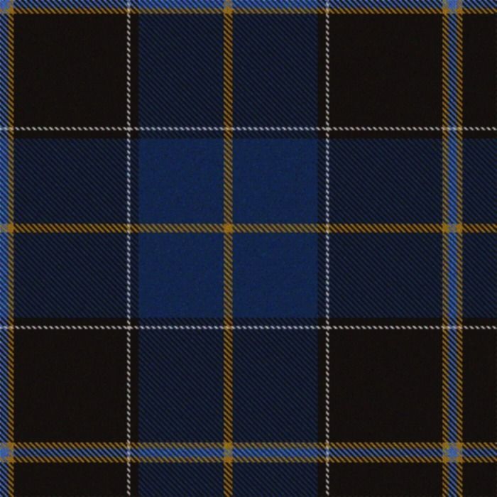
One thing to perhaps keep in mind when designing a tartan is the proportions.
Most of the rectilinear things we see (television screens, monitors, windows, painting, photographs, cell phones, postage stamps, posters, books, mirrors, many walls, many tables, etc etc) are made, more or less according to the sense of proportion analyzed and consciously used by the ancient Greeks and by Western culture ever since. It is called The Golden Proportion, Golden Mean, or Golden Ratio. (It is related to The Rule Of Thirds in my opinion.)
Many traditional tartans follow this near-universal aesthetic too, for designs that violate it tend to strike us (usually unconsciously, unless one has had art or design training) as unsettled, ungainly, cumbersome, inelegant, or simply 'not right'. Were one to create an entire home (completely furnished) based on a proportion different from the Golden one people walking through it would find it inexplicably unsettling.
Things which are 50/50 aren't as ungainly as ones more subtly divergent for some reason. Here's a simplified version of Wizard's tartan attempting to get as 50/50 as possible (I was unable to get it to look absolutely even no matter how I arranged the thread count)

Here are the same elements rearranged in more classic proportions, as weavers have been using for hundreds of years

and flipped the other way

Neither perhaps is as strong as the 50/50 one, the upper one in this post.
What strikes the eye, at least the trained one, as unsettled or conflicted is if the proportions are neither 50/50 nor follow traditional classic proportions. When I look at this it seems like the various elements are fighting for dominance rather than working together

Another thing (while I'm up here on my soapbox) is to try to get past our post-Allen Brothers tendency to create simplistic diagrammatic tartans, and try to get back to the ethos of many early tartans which were often quite complex, sometimes to the point of looking dissipated. Here's an attempt at throwing aside the Sobieski curse and make something with more meat in it

Here is perhaps my favourite, striking a balance between complexity and simplicity

Last edited by OC Richard; 11th April 14 at 07:54 PM.
Proud Mountaineer from the Highlands of West Virginia; son of the Revolution and Civil War; first Europeans on the Guyandotte
-
 Posting Permissions
- You may not post new threads
- You may not post replies
- You may not post attachments
- You may not edit your posts
-
Forum Rules
|
|


Bookmarks