|
-
5th August 10, 05:37 AM
#1
WIP Tartan Design - Suggestions Please!
Hi All,
Since I'm as Scottish as Prince Albert (ie, not at all) I have no family tartan. My wife is part Irish, with a trace of Scottish. Her "Irish County Tartan" is only woven in 13oz, and she has no real connection to the distant Scottish part of the family line (WAY back).
As I slowly drift toward a really nice kilt, I'd like the tartan to mean something for me, so I've decided to design one. I know people have various opinions on the flood of "new" tartans, but that's a conversation for a different thread.
Without further ado, here are a few shots of Mk6
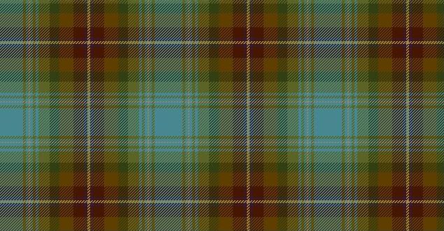
Zoom
I started with a thread count that I liked, then modified spacings, added some extra details, and flipped the light-to-dark ratio around.
I should also add that the designer I'm using doesn't have the proper blue, this one is too teal, the blue I'm actually aiming for is a bit more slate grey than this (but you get the idea). Also, the lightest tan should be more of a vanilla-creme colour, but again, the designer is somewhat limited in it's options.
Any constructive comments or critique would be wonderful.
I should also add that I'm aiming toward a box pleat, but still teeter back and forth on a really nice 8yd knife pleat.
Thanks in advance.
-
-
5th August 10, 06:23 PM
#2
That's a really beautiful and effective tartan design, I think, Scott. It's intricate, but doesn't took "busy"; if you're designing such a complex tartan, I feel like it's very important to keep it looking tidy, in order to avoid the impression of color noise.
I think it's coming along beautifully, and has a balance that should be well suited for kilting(and look especially good in a box pleat, I suspect).
Excelent design, good sir. 
-
-
5th August 10, 09:55 PM
#3
My eyes are too tired at this point to offer any useful critique... but perhaps the fact that I'm having trouble focusing on your tartan says something. I'll look at it again tomorrow
For now, I'll ask what program/website you used to design it? And what was the thread count that you liked and modified to come up with it?
- Justitia et fortitudo invincibilia sunt
- An t'arm breac dearg
-
-
5th August 10, 10:37 PM
#4
It looks nice, I think the dark blue next to the yellow needs to be a few threads bigger. Even on zoom, which appears to be actually size, it is not really noticeable if you step back 2 feet.
At first I was not sure about the light blue, but again looking at it from a distance it has a nice off-set to the other colors,
There would be a number of interesting ways to pleat this;
yellow stripe
Blue Stripe
alternate yellow and blue
green
-
-
6th August 10, 04:18 AM
#5
I prefer more colour definition between different colours in a tartan. As nice as it is, I am seeing, fade in, fade out, fade in, fade out.
Maybe it is just my eyes, but the areas of darker colour look like dots from a distance, rather than stripes.
Sorry.
Regards
Chas
-
-
6th August 10, 11:08 AM
#6
Well, even if Charles finds it a bit spotty, I quite like it.
Regards,
Mike
The fear of the Lord is a fountain of life.
[Proverbs 14:27]
-
-
7th August 10, 03:47 PM
#7
 Originally Posted by CMcG

My eyes are too tired at this point to offer any useful critique... but perhaps the fact that I'm having trouble focusing on your tartan says something. I'll look at it again tomorrow
For now, I'll ask what program/website you used to design it? And what was the thread count that you liked and modified to come up with it?
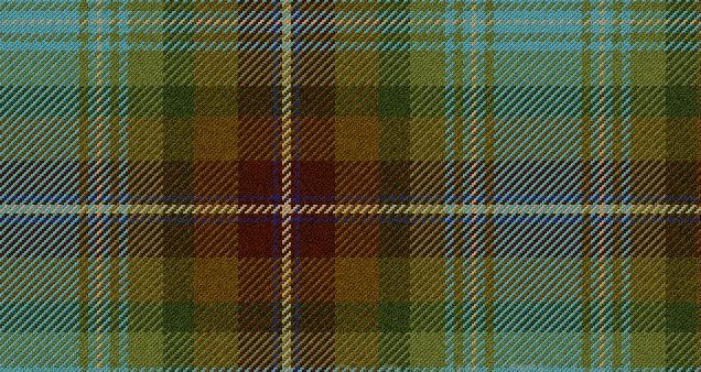
I used the online tartan designer from Gaelic Themes. It's the one that seems to work best for me.
I started with the Isle of Skye for the basic thread count. I then changed the colours to something that I wanted and reversed the direction. IE, IoS has the lightest colours bracketing the main stripe, I wanted to have the main stripe pop out of darkest area of the tartan. I thought this would lend itself wonderfully to a box pleat with the creme stripe on-center in each pleat. This would give a 'reveal' of the lighter blue inside the pleats.
After I changed the light/dark order, and adjusted the widths of each stripe to my liking, the blue spaces were too pronounced. Adding another large creme stripe was... unpleasant. I ended up adding a few smaller creme stripes each bracketed by the blue.
It was still lacking a little something, so I added the darker blue near the creme (which adds a surprising amount. Without it the darker section just isn't working).
Originally Posted by Kilted-Marine
It looks nice, I think the dark blue next to the yellow needs to be a few threads bigger. Even on zoom, which appears to be actually size, it is not really noticeable if you step back 2 feet.
Good call, I went back in and enlarged the darker blue stripe by about 50% and it really made a big difference, thank you.
Originally Posted by Chas
I prefer more colour definition between different colours in a tartan. As nice as it is, I am seeing, fade in, fade out, fade in, fade out.
Maybe it is just my eyes, but the areas of darker colour look like dots from a distance, rather than stripes.
Sorry.
Regards
Chas
No need to be sorry, I asked for critique . After you brought this up, I DO see the darker olive green giving a slightly 'dot' look to the tartan. I'm thinking much of that can be resolved in final wool choices. Again, the colours on the designer don't allow for too much variation. I'd like everything to have a slightly soft tone, not exactly 'ancient' but not too saturated either. . After you brought this up, I DO see the darker olive green giving a slightly 'dot' look to the tartan. I'm thinking much of that can be resolved in final wool choices. Again, the colours on the designer don't allow for too much variation. I'd like everything to have a slightly soft tone, not exactly 'ancient' but not too saturated either.
Thanks all for the feedback thus far, I'll be posting a revised version in the next day or two as I tweak it.
-
-
8th August 10, 07:53 AM
#8
Originally Posted by artificer
I started with the Isle of Skye for the basic thread count. I then changed the colours to something that I wanted and reversed the direction. IE, IoS has the lightest colours bracketing the main stripe, I wanted to have the main stripe pop out of darkest area of the tartan. I thought this would lend itself wonderfully to a box pleat with the creme stripe on-center in each pleat. This would give a 'reveal' of the lighter blue inside the pleats.
After I changed the light/dark order, and adjusted the widths of each stripe to my liking, the blue spaces were too pronounced. Adding another large creme stripe was... unpleasant. I ended up adding a few smaller creme stripes each bracketed by the blue.
It was still lacking a little something, so I added the darker blue near the creme (which adds a surprising amount. Without it the darker section just isn't working).
<snip>
OK, I think I see what you were going for and that does sound like a striking idea for pleating to the stripe. Unfortunately, something about the sett itself isn't quite working for me. I understand that the colours aren't quite what you have in mind but I'm assuming the general light-to-dark ratio is correct. And therein lies my problem...
Lighter colours tend to have the effect of moving forwards while darker colours lie back. When you reversed the light to dark of the Isle of Skye, you kept the lightest part the same; the cream line on your red background. The result is that that the cream line on the red is fighting against the light blue (or slate grey that you intended) with small cream lines..
Personally, I like a tartan to have a distinct field and foreground because it gives both depth and definition. In keeping with your idea of reversing the lights and darks of the Isle of Skye, try changing the cream line on the red to a deeper colour so that it pushes back and lets the blue stand out.
Just an opinion FWIW...
Originally Posted by artificer
Without further ado, here are a few shots of Mk6
<snip>

- Justitia et fortitudo invincibilia sunt
- An t'arm breac dearg
-
-
8th August 10, 08:32 PM
#9
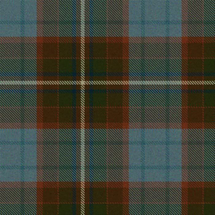
You could check out the Auld Scotland tartan which has a similar colour palette and is also based on IOS.

-
-
19th December 10, 08:19 AM
#10
After a lot of fiddling about, I've come up with another design that I think I'm happier with- having taken the feedback from the prior design.
The green is gone, as I am having trouble balancing the design without it ending up GREEN or just 'blah'.
I've simplified the darker field, and gone with a richer, more coppery colour. The blue is fairly close to what I want as well.
Below is a variant incorporating an additional vanilla stripe through the blue field, but I don't think that I like this one as much as the above.
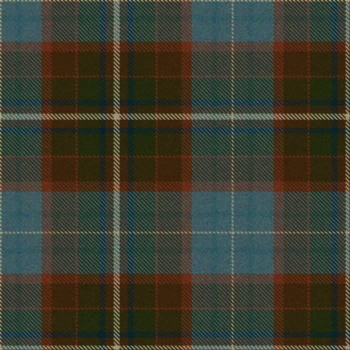
Any thoughts from the rabble? I still really like the idea of the lighter, more simple blue field being 'hidden' inside the pleat, either as a box or knife pleat which would give a very dynamic 'reveal' as the pleats swish.
-
Similar Threads
-
By Mark Keeney in forum The Tartan Place
Replies: 11
Last Post: 15th September 06, 11:08 AM
 Posting Permissions
- You may not post new threads
- You may not post replies
- You may not post attachments
- You may not edit your posts
-
Forum Rules
|
|


Bookmarks