|
-
19th December 10, 10:22 AM
#11
Greetings,
My advice is take your time with it...if after a time you aren't feeling the design anymore, you can make more changes or start again and when you feel it can't be improved upon and it's arranged to compliment its rationale, thats when to get it done...for me I spent 2 years working on my personal tartan, I went through so many setts my head was spinning and often headaches ensued...LOL, but have fun with it, and enjoy the creative freedom that comes with exploring the possible arrangements, of the colours that have a special meaning to you.
Good Luck!
All the best,
Graham
Last edited by Graham A. Robieson; 19th December 10 at 02:04 PM.
Reason: Spelling of ensued
-
-
19th December 10, 11:37 AM
#12
I like this new design very much, Scott. Less 'busy' than the first, but still expressive with 'depth'. Yes, I like the new direction.
-
-
19th December 10, 01:22 PM
#13
 Originally Posted by xman

I like this new design very much, Scott. Less 'busy' than the first, but still expressive with 'depth'. Yes, I like the new direction.
I'm with 'X'! 
Scott, of the two new designs, I personally like the 2nd one with the additional vanilla line in the blue field just a wee bit better. Something about it really grabs me.
Having said that though, mine is just one opinion (and you will receive many). In the end its your choice that counts....I like what Graham said about taking your time with it.
I can't wait to see what you finally come up with & see it worn as a kilt! 
Originally Posted by artificer
After a lot of fiddling about, I've come up with another design that I think I'm happier with- having taken the feedback from the prior design.
The green is gone, as I am having trouble balancing the design without it ending up GREEN or just 'blah'.
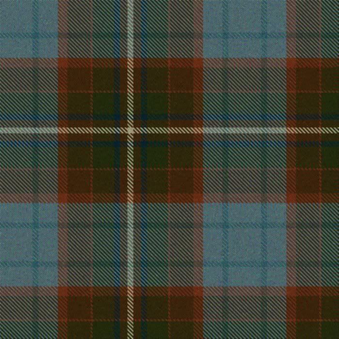
I've simplified the darker field, and gone with a richer, more coppery colour. The blue is fairly close to what I want as well.
Below is a variant incorporating an additional vanilla stripe through the blue field, but I don't think that I like this one as much as the above.
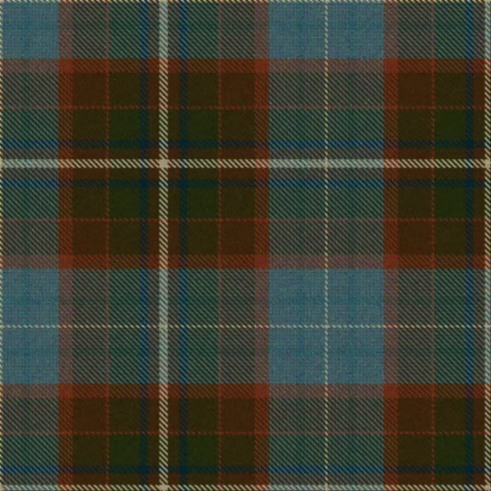
Any thoughts from the rabble? I still really like the idea of the lighter, more simple blue field being 'hidden' inside the pleat, either as a box or knife pleat which would give a very dynamic 'reveal' as the pleats swish.
[SIZE="2"][FONT="Georgia"][COLOR="DarkGreen"][B][I]T. E. ("TERRY") HOLMES[/I][/B][/COLOR][/FONT][/SIZE]
[SIZE="1"][FONT="Georgia"][COLOR="DarkGreen"][B][I]proud descendant of the McReynolds/MacRanalds of Ulster & Keppoch, Somerled & Robert the Bruce.[/SIZE]
[SIZE="1"]"Ah, here comes the Bold Highlander. No @rse in his breeks but too proud to tug his forelock..." Rob Roy (1995)[/I][/B][/COLOR][/FONT][/SIZE]
-
-
19th December 10, 06:00 PM
#14
Have you tried printing several copies of these designs, taping them together and then pleating them in different ways? That might help in the design process, as well as giving you some direction toward which pleat style will look best.
I like the latest design with the "vanilla" stripe. I want you to box-pleat the tartan to hide the light blue, so you'll have the light "flash" when you walk.
--dbh
When given a choice, most people will choose.
-
-
19th December 10, 06:25 PM
#15
Very nicely done -- even if it's still a work in progress!
*** in favor of the version w. the "vanilla" stripe.
-
-
19th December 10, 08:24 PM
#16
Very nice...I think I like the 2nd design too. Looks like it would be interesting to weave. Please post pics of your finial decisions.
-
-
19th December 10, 10:28 PM
#17
In humblest of opinions, I must say I prefer the second tartan greatly. If you're unsure about the additional thin stripe, I would consider all your future possibilities. You might prefer a box pleat for the first kilt, but maybe later a 8 yd knife. Spend your time now carefully crafting a tartan that will suit any style of pleating. One additional thin stripe, whatever the color, greatly increases your options.
That being said, I noticed you had faded out the additional blue stripes when adding the cream. Having you tried tossing them all together and making the accent stripe the same dark blue? It would leave the large cream stripe as the real pop for the sett and would allow you a dark reveal in either box or knife pleat. Just a fanciful suggestion.
-
-
20th December 10, 12:14 AM
#18
A couple of thoughts:
1. The broader white on the green/brown ground will dominate the sett from a distance in much the same way that it does on the Forbes/Lamont sett or the yellow does in the Gordon. If that's not what you want then think again.
2. I don't like the blue shade which I find too insipid and it it were me I'd make it darker.
3. The green stripes on the blue are too similar in shade and will disappear when viewed at a distance, so what's the point of having them? Similarly, the white on the blue will look very faint unless it it is balanced proportionally against the white on the green.
-
-
20th December 10, 05:56 AM
#19
I definitely like the second design better (although I also like the look of the first design too).
The blue/green/rust color scheme is very attractive and unique. I can't think of any other tartan I've seen that looks like this. It would look stunning with the blue fields hidden in the pleats to 'flash' when you walk.
I like it better without the second cream stripe, though. Putting that cream stripe in the blue field seems to throw off the nice clean lines. It breaks up the pattern, if that makes sense. Even though you're using a lot of colors and a fairly complex design in the darker portions of the tartan, it still has a nice clean look from a distance. But that thin white stripe in the blue field breaks that cleanness up.
How many colors are you using? I count 7, but I could be wrong. Didn't someone say that most weavers would only do 6 colors?
-
-
20th December 10, 06:22 AM
#20
 Mk6 Mk6
I think they are both very nice but I found the first one more attractive. Quite lovely how the muted colors flow into one another. I can only imagine the sight of it in motion.
Hugh
-
Similar Threads
-
By Mark Keeney in forum The Tartan Place
Replies: 11
Last Post: 15th September 06, 11:08 AM
 Posting Permissions
- You may not post new threads
- You may not post replies
- You may not post attachments
- You may not edit your posts
-
Forum Rules
|
|


Bookmarks