|
-
13th May 11, 07:05 AM
#21
Something you need to bear in mind is the tapering from the hips to waist, this is different for everyone but a pleat might be 3/4" on the hips and go to 1/2" on the waist..For the stripe pleating to be pleasing I think nothing of the stripe should disappear by the time it gets to the narrowest bit. This means in essence that whatever stripe you choose it should be able to be contained within the narrow bit of the pleat width.
Using your new pictures, the red line seems fine, the light blue fine as well( although as I mentioned earlier some like the colours to be mirrored precisely, but it's not essential), but I think the double yellow lines probably wouldn't work if they are wider than 1/2" (using the current measurements).
When I get a new piece of cloth for a customer, I make up a little pleat shape in card, I use it to measure the distances when I am sewing, but it's also such a useful guideto be able to show the client what works and what doesn't.To be able to see the actual pleat size makes the decision very much faster!
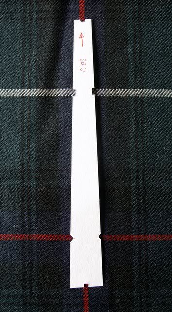
I also put a few notches on it so I can work out the placement very quickly.Making the template is really very fast, and it really is very useful
I know you are working from pictures/print outs, but it might be worth actually cutting a few up and making the actual pleat widths, just to see, to be honest you could take any measurements just to see how it affects the looks, especially as when you get to the real thing, 12 or more band members are going to be 12 different sizes as well!
-
-
13th May 11, 07:08 AM
#22
Last edited by davidlpope; 13th May 11 at 07:34 AM.
-
-
13th May 11, 07:17 AM
#23
 Originally Posted by paulhenry

Something you need to bear in mind is the tapering from the hips to waist, this is different for everyone but a pleat might be 3/4" on the hips and go to 1/2" on the waist..For the stripe pleating to be pleasing I think nothing of the stripe should disappear by the time it gets to the narrowest bit. This means in essence that whatever stripe you choose it should be able to be contained within the narrow bit of the pleat width.
Using your new pictures, the red line seems fine, the light blue fine as well( although as I mentioned earlier some like the colours to be mirrored precisely, but it's not essential), but I think the double yellow lines probably wouldn't work if they are wider than 1/2" (using the current measurements).
When I get a new piece of cloth for a customer, I make up a little pleat shape in card, I use it to measure the distances when I am sewing, but it's also such a useful guideto be able to show the client what works and what doesn't.To be able to see the actual pleat size makes the decision very much faster!
[IMG][/IMG]
I also put a few notches on it so I can work out the placement very quickly.Making the template is really very fast, and it really is very useful
I know you are working from pictures/print outs, but it might be worth actually cutting a few up and making the actual pleat widths, just to see, to be honest you could take any measurements just to see how it affects the looks, especially as when you get to the real thing, 12 or more band members are going to be 12 different sizes as well!
Excellent! And thanks! (I began thinking that the yellow lines wouldn't work after more careful review... which is fine, because they're my least favorite anyway.) I did the light blue based on your example of non mirror images, and that one has turned out to be my favorite.
I really like the card idea and will mention it to our committee. I'm trying to get everyone to begin narrowing down my some 13 different designs, and one of the decision factors is going to be how it looks pleated to stripe. Now one of our members has mentioned preference for pleating to sett... which I don't personally care for.
I am sure to continue posting as we move forward in our endeavor. Your help has been most valuable to me. :-)
-
-
13th May 11, 07:21 AM
#24
It looks like the yellow stripes are about an inch apart. Perhaps center one of those, and let the other "hide" inside the pleat if you want the yellow outside.
-
-
13th May 11, 07:22 AM
#25
Originally Posted by davidlpope
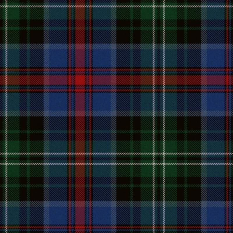
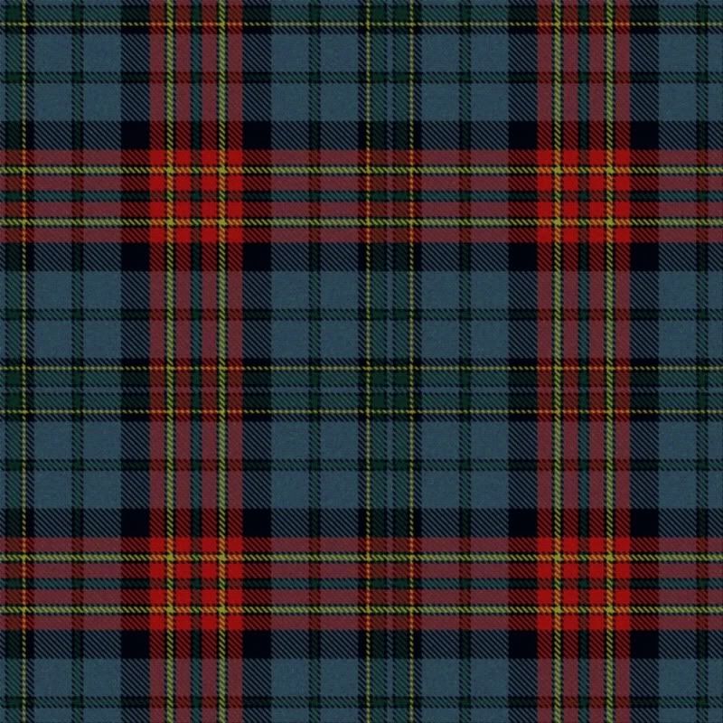
Nice-looking tartan. This would pleat to red line nicely. The distance between the two yellow lines can be a bit tricky, though. Our Hunting MacMillan tartan features the same element and in some weaves (depending on sett size) you either have to have a wider pleat featuring both yellow lines or a very narrow pleat featuring one yellow line. Just something to think about.
I'm encouraged that you to put black guard stripes on both the yellow and red stripes. I find that this small addition makes a big difference in how good a tartan looks in the weathered color scheme.
Yes, I think the yellow lines are out, although I may check to see how it does pleating to one of them just so I can cover my bases with our committee. This is probably my number one choice for our tartan. The double yellow might have worked with a box-pleat, which is what I wear (until I get my Kinguissie later this month). But the band needs knife pleats, so I'm learning how to make it work.
Thanks! The guard stripes I've found really make it look cleaner and more pronounced. Oddly enough, I figured this out doing old style video game graphics.
-
-
13th May 11, 08:29 AM
#26
James, as nice as your design is I think it lacks something. The band is going to be wearing this design for, well forever. It looks like so many others in the Register. MacLeod, MacKenzie and and and... You have this once in a lifetime golden opportunity to create "Oh Wow", but at the moment, all I am seeing is "safe".
I really think you should be consulting with Matt and Rocky and with Rex.
Sorry.
Regards
Chas
-
-
13th May 11, 08:56 AM
#27
Originally Posted by Chas
James, as nice as your design is I think it lacks something. The band is going to be wearing this design for, well forever. It looks like so many others in the Register. MacLeod, MacKenzie and and and... You have this once in a lifetime golden opportunity to create "Oh Wow", but at the moment, all I am seeing is "safe".
I really think you should be consulting with Matt and Rocky and with Rex.
Sorry.
Regards
Chas
There are some other designs, and I agree that something needs to be eye-catching. Most of us however tend to be traditionalists and something "off the wall" isn't really going to fly too well.
I originally started basing my designs off of the Louisiana tartan, then moved to what our band's and society's "official" tartan Fergusson. And worked from there. This doesn't really end up looking too much like Fergusson, but it's where I started anyway.
Here are some other designs that I've created. Some are just variations on this one, others are variations on these. Some I'm just not including now.
This is based on the LA Tartan.
This is has some elements of the LA Tartan, but was just a design I was playing around with.
This one I went away from the prominent blues and greens. It's okay and all, but I don't think it will go as well with the rest of the band's uniform.
This one I have taken off the table, but it was a different sort of design.
This is the original version of the first tartan I posted. I like the brown and I think it is very different looking.
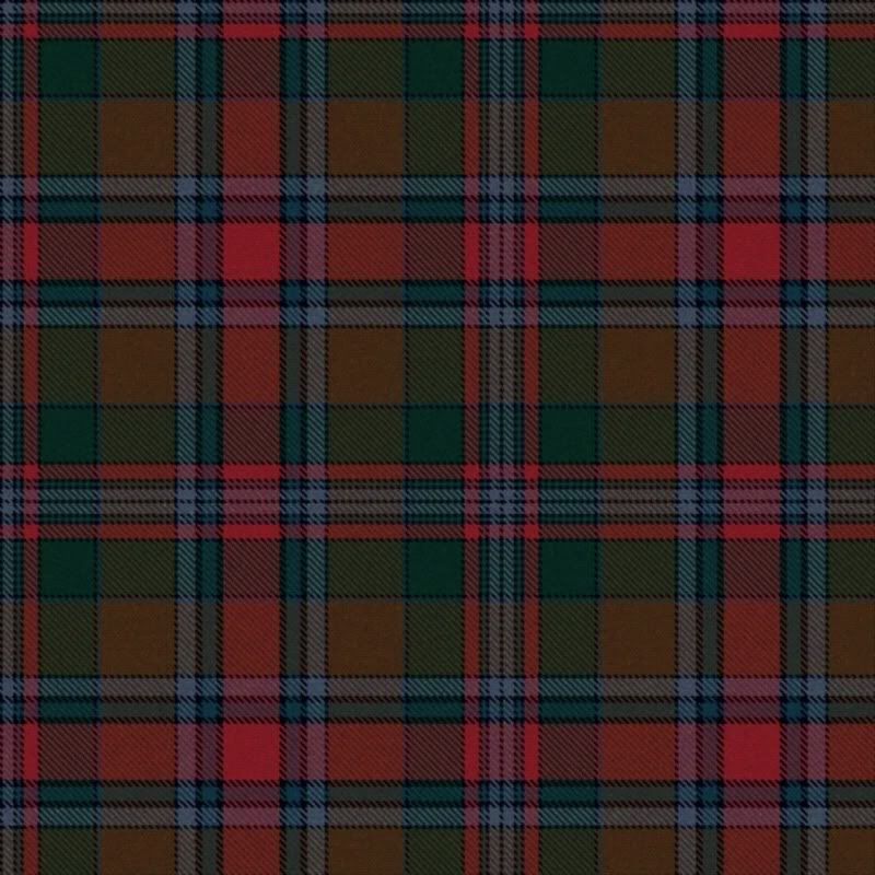
All in all though, I like the design you've criticized. But I understand and appreciate your critique. I'm shooting for more traditional, but there should be SOMEthing to make it standout from the others. The only directive I received was that it ought to have a red stripe for Baton Rouge and to tone with the red accents of the rest of the uniform.
-
-
13th May 11, 09:36 AM
#28
Originally Posted by Semiomniscient
The only directive I received was that it ought to have a red stripe for Baton Rouge and to tone with the red accents of the rest of the uniform.
I think the pleating to the red stripe you showed in one of your earlier posts would work quite well based on that criteria. That's what I think of when I hear 'pleated to the stripe'.
Good luck in the decision!
John
-
-
13th May 11, 04:58 PM
#29
I like the new tartan, both pleated to the red stripe and pleated to the light blue. I also like the first one based on the Louisiana tartan, although I think I would pleat that one to the narrow black pivot stripe.
-
-
16th May 11, 09:27 AM
#30
Originally Posted by Chas
James, as nice as your design is I think it lacks something. The band is going to be wearing this design for, well forever. It looks like so many others in the Register. MacLeod, MacKenzie and and and... You have this once in a lifetime golden opportunity to create "Oh Wow", but at the moment, all I am seeing is "safe".
I really think you should be consulting with Matt and Rocky and with Rex.
Sorry.
Regards
Chas
Chas,
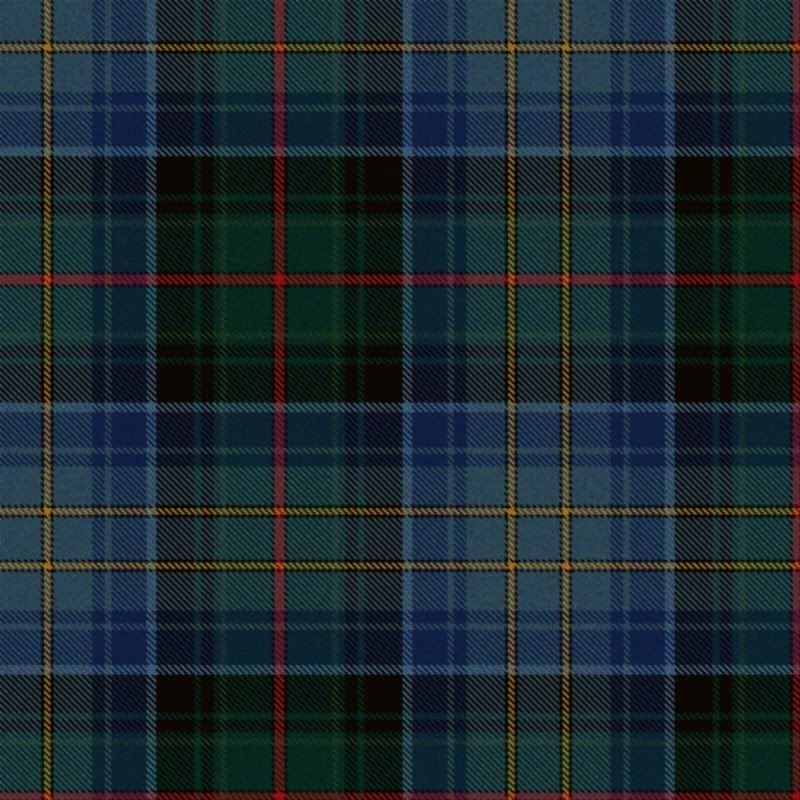
Given some thought to your comments, and the more I thought about it, the more I thought you were really on to something. I created this tartan, a modified of my first choice. I think it may look more traditional from a distance, but look more and more interesting the closer you get. But I may be reading too much into it. Please let me know what you think. I can take the critique.
-
Similar Threads
-
By Alan H in forum The Tartan Place
Replies: 7
Last Post: 29th April 11, 07:31 PM
-
By Tibbsy in forum The Tartan Place
Replies: 6
Last Post: 10th January 11, 01:12 AM
-
By Valencian Kilted in forum General Kilt Talk
Replies: 42
Last Post: 12th January 06, 02:05 AM
 Posting Permissions
- You may not post new threads
- You may not post replies
- You may not post attachments
- You may not edit your posts
-
Forum Rules
|
|


Bookmarks