|
-
10th June 11, 08:58 PM
#111
 Originally Posted by JSFMACLJR

No need for the patronizing attitude, Mr. Henry: I'm quite knowledgeable about Scots heraldry.
Quite often, one of the shortcomings of internet communications is trying to determine the attitude or intent of a "speaker." Since we have not communicated with each other before, and since I have no idea how well-versed you might be in Scottish heraldry (and with an eye toward any curious people who may be reading this thread with a limited understanding of heraldry), I was simply trying to clarify what the situation was with your father's grant. If my wording offended you, that was not my intent. My sincere apologies.
The Rev. William B. Henry, Jr.
"With Your Shield or On It!"
-
-
10th June 11, 09:18 PM
#112
Originally Posted by JSFMACLJR
You are correct, I believe. Lord Lyon does grant crests to clerics, but generally they prefer a hat, with a separate grant of a crest to the lay heirs.
In my communication with Lord Lyon Blair, he indicated that he preferred not to grant crests to priests, but would entertain the possibility if the petitioner really wanted one.
This is somewhat different than the practice in Ireland where grants, in the first instance, are made without regard to the practice or profession of the petitioner. In other words everyone seeking a grant of arms is entitled to three basic elements: the shield of arms, the crest (which may or may not be displayed on a helmet), and a motto.
Generally the position taken with regard to clergy is that while the crest is regularly granted, it is up to the cleric to decide whether or not he wishes to use it.
-
-
11th June 11, 06:37 AM
#113
Originally Posted by WBHenry
piperdbh: "You've switched pews, but you're still in the same church." Although Lord Lyon would not be involved, the CoA would be. Unless you can prove you are a direct descendent of the original armiger and are entitled to those particular arms, it's a non-starter. There is no such thing as a "family coat-of-arms," at least not the way you are looking at it. England, Scotland, Ireland, and Wales have very specific rules concerning the inheritance of arms. In very general terms, a coat-of arms in those country can only belong to one individual at a time (other members of the family who are entitled must difference the arms in one way or another in order to use them). If one wishes to honor one's ancestors from the "old country" through the use of heraldry, then one should also honor the system under which those ancestors were granted their arms.
This rule is not peculiar to the British Isles. It is the basic rule everywhere heraldry is used: if you're not a direct descendant of the original bearer of the arms, you have no right to them. There are rare exceptions, but they usually require (or required) official approval, either royal or parliamentary.
General rule of thumb: If they were not your grandfather's arms, you are probably not entitled to use them (99.9999999 times out of a hundred).
Why? English and most other arms (except Scottish) are automatically inherited and passed on by all legitimate sons ad infinitum. This is so well established that it's even in the classic legal textbooks like Coke and Blackstone.
Now, if you believe you are in some distant way related to the original armiger, you could use those arms as a starting point for creating arms which you can assume.
If the relationship is direct, no matter how many generations, you can use the arms as you find them, but you should be able to prove the descent, not just speculate on it.
If by distant we mean that it was an uncle or cousin who was the original bearer of the arms, then yes, you need to difference them somehow.
-
-
11th June 11, 09:27 AM
#114
Greetings, Joseph. Perhaps I misspoke. The only point I was trying to make is that it is pretty long odds that a "bucket shop" set of "family arms" would apply to any given individual who happens to share the same name. There is no substitute for researching one's own family history, rather than simply guessing (or hoping) that a given set of arms you may run across may be used with impunity.
BTW, have you acquired a kilt yet? 
The Rev. William B. Henry, Jr.
"With Your Shield or On It!"
-
-
11th June 11, 06:29 PM
#115
Originally Posted by werewolves
Great to see so many folks from the AHS here 
My assumed arms done in the style of the Codex Manesse for fun. Link to the registration in my signature.
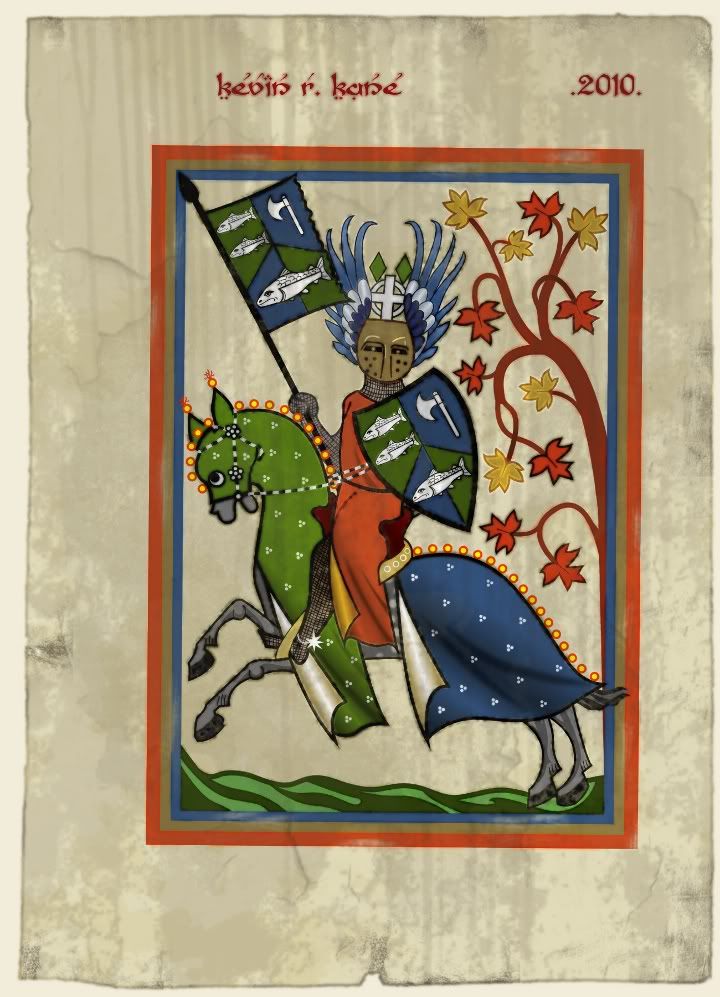
Wonderfully unique artwork!
Stìophan, Clann Mhic Leòid na Hearadh
Steven, Clan MacLeod of Harris
Dandelion Pursuivant of Arms
-
-
12th June 11, 10:31 AM
#116
My recollection (from reading a variety of sources) is that the English heralds generally prefer not to grant a crest to a cleric, but will do so if requested. Usually this is reserved to later generations, but not necessarily.
And in support of Bill Henry, I would reaffirm that there is no substitute for research.
If you can prove a connection through descent from an armiger, there is a good chance that you can bear his arms, or a variation of them.
If you have done no research, or if your research has not demonstrated such a connection, you should look at a fresh design.
Regards,
Mike
The fear of the Lord is a fountain of life.
[Proverbs 14:27]
-
-
12th June 11, 10:50 AM
#117
Taking MacMillan of Rathdown's advice into consideration, this is what I now have:

I tried it with the galley Or, but it just didn't feel as balanced as it does with it Argent; I did, however, change the flag colour from Gules to Or.
The shield looks just fine with three fluer-de-lys Gules, but I felt like something was missing. The lion is a symbol that connects the Swan arms with many MacDonald arms, and having a great deal of MacDonald heritage, I couldn't just leave it out. A lion rampant would, like the galley in the previous version, have been too "busy" for such a small space, so I decided to replace the small galley on the chevron with a lion's head erased Gules langued Azure.
The blazon, to the best of my ability, is:
Azure, between two swans with wings expanded Proper in chief and a lymphad Argent flagged Or with sails furled and oars in action in base, on a chevron embattled counter-embattled Argent a lion’s head erased Gules langued Azure between two fluers de lys Gules; all within a bordure Or; over all a label of three points Gules.
What does everyone think now?
Last edited by Cygnus; 12th June 11 at 10:57 AM.
-
-
12th June 11, 02:09 PM
#118
First and foremost I'd like to say that it really doesn't matter what others think, as long as you are happy with your arms. That said I definitely think this version is better; the red charges on the chevron really bring the arms to life, as does the galley in base. I still have some reservations about the lion's head on the chevron. On my monitor the shield measures 2.25 inches from top to base point; if you reduce it to 3/4 of an inch (the size it might be on letter paper, a calling card, or the rim of a plate) I'm not sure the lion's head erased would be all that legible (it might be mistaken for a bit of current stuck to the plate).
Since a galley on a gold field figures prominently in M'Donald heraldry, might I suggest you consider doing away with the embattled chevron and blazon your arms simply: per chevron azure and or in chief two swans argent, in base a galley. By eliminating the chevron you would at once gain more space for the swans and galley-- which seem to be the focus of the heraldic statement you are trying to make-- while making the full achievement readable if reduced in size.
As far as cadency is concerned, with this proposed blazon, there are three options: (1) using a black line to separate the bordure from the base; (2) using a chequey bordure; (3) and the instance I would favour, placing a small crescent between the swans. Thus, you would inherit your father's plain coat, and your younger siblings could then difference by bordure in the usual fashion.
Back to you!
-
-
12th June 11, 03:54 PM
#119
Thank you, Scott, for your feedback - it is greatly appreciated!
I actually posted something much as you described on the first page of this thread (though I drew the bordure counter compony rather than chequey). I like those arms, but actually like these ones better.
The arms upon which I am basing these were granted to James Swan in 1828, the blazon is as follows:
Azure, on a chevron between two swans in chief and a lion passant guardant in base Argent, a heart Proper between two falconer's gloves Sable tassled Gules
It's a pretty busy shield, but I am fond of it. And I'd be very happy if the only charge that is difficult to discern from a seal or card is the lion's head; there are many coats of arms that would be nearly impossible to accurately read at a smaller size due to the number of small charges on them.
I often change my mind, and I will certainly have plenty of time to do so before these arms become permanent; though I am almost certain it will be included as my "desired arms" when I do petition my own arms.
-
-
12th June 11, 04:05 PM
#120
Originally Posted by Cygnus
Thank you, Scott, for your feedback - it is greatly appreciated!
I actually posted something much as you described on the first page of this thread (though I drew the bordure counter compony rather than chequey). I like those arms, but actually like these ones better.
The arms upon which I am basing these were granted to James Swan in 1828, the blazon is as follows:
Azure, on a chevron between two swans in chief and a lion passant guardant in base Argent, a heart Proper between two falconer's gloves Sable tassled Gules
It's a pretty busy shield, but I am fond of it. And I'd be very happy if the only charge that is difficult to discern from a seal or card is the lion's head; there are many coats of arms that would be nearly impossible to accurately read at a smaller size due to the number of small charges on them.
I often change my mind, and I will certainly have plenty of time to do so before these arms become permanent; though I am almost certain it will be included as my "desired arms" when I do petition my own arms.
Just out of curiosity who do you plan on petitioning your arms from? I'm just starting to understand the world of heraldry but still pretty clueless. Thanks.
"Blood is the price of victory"
- Karl von Clausewitz
-
Similar Threads
-
By be da veva in forum General Kilt Talk
Replies: 6
Last Post: 8th March 10, 04:52 PM
-
By possingk in forum General Kilt Talk
Replies: 38
Last Post: 19th January 07, 07:10 AM
Tags for this Thread
 Posting Permissions
- You may not post new threads
- You may not post replies
- You may not post attachments
- You may not edit your posts
-
Forum Rules
|
|


Bookmarks