X Marks the Scot - An on-line community of kilt wearers.
|
-
5th August 10, 05:37 AM
#1
WIP Tartan Design - Suggestions Please!
Hi All,
Since I'm as Scottish as Prince Albert (ie, not at all) I have no family tartan. My wife is part Irish, with a trace of Scottish. Her "Irish County Tartan" is only woven in 13oz, and she has no real connection to the distant Scottish part of the family line (WAY back).
As I slowly drift toward a really nice kilt, I'd like the tartan to mean something for me, so I've decided to design one. I know people have various opinions on the flood of "new" tartans, but that's a conversation for a different thread.
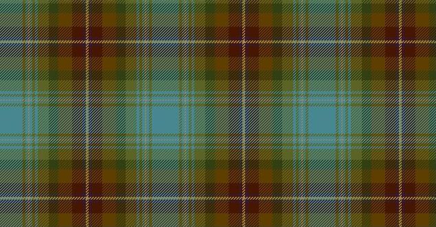
Without further ado, here are a few shots of Mk6
Zoom
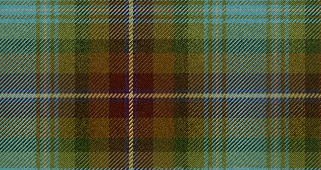
I started with a thread count that I liked, then modified spacings, added some extra details, and flipped the light-to-dark ratio around.
I should also add that the designer I'm using doesn't have the proper blue, this one is too teal, the blue I'm actually aiming for is a bit more slate grey than this (but you get the idea). Also, the lightest tan should be more of a vanilla-creme colour, but again, the designer is somewhat limited in it's options.
Any constructive comments or critique would be wonderful.
I should also add that I'm aiming toward a box pleat, but still teeter back and forth on a really nice 8yd knife pleat.
Thanks in advance.
-
Similar Threads
-
By Mark Keeney in forum The Tartan Place
Replies: 11
Last Post: 15th September 06, 11:08 AM
 Posting Permissions
- You may not post new threads
- You may not post replies
- You may not post attachments
- You may not edit your posts
-
Forum Rules
|
|


Bookmarks