|
-
7th April 11, 08:59 AM
#1
Mike,
I like the idea, but I think the color arrangement could be improved to more closely resemble the flag. By switching the blue and green on yours and alternating the wide (now) blue stripe with the wide red stripe, you can have the colors match up exactly how the flag does:

To give it a little more pizazz, you could also add some white pinstripes in the middle of the red and blue sections, like this:

Regards,
Last edited by SlackerDrummer; 7th April 11 at 09:26 AM.
Reason: Changed link to images
Kenneth Mansfield
NON OBLIVISCAR
My tartan quilt: Austin, Campbell, Hamilton, MacBean, MacFarlane, MacLean, MacRae, Robertson, Sinclair (and counting)
-
-
7th April 11, 09:15 AM
#2
Hi, Ken I am unable to make sense of your suggestions, because the images have been replaced on my screen by a picture of a frog on an ice block many images posted from the US on X Marks have this problem for me (and I am not sure in what other countries the problem exists).
Perhaps you should link your pictures from Photobucket.
Regards,
Mike
The fear of the Lord is a fountain of life.
[Proverbs 14:27]
-
-
7th April 11, 09:27 AM
#3
I uploaded the images to my album here and edited my previous post. See if that helps.
Kenneth Mansfield
NON OBLIVISCAR
My tartan quilt: Austin, Campbell, Hamilton, MacBean, MacFarlane, MacLean, MacRae, Robertson, Sinclair (and counting)
-
-
7th April 11, 10:35 AM
#4
Hi, Ken you have some useful ideas there, but now the red and blue are too large, and the pinstripes dont work for me.
Regards,
Mike
The fear of the Lord is a fountain of life.
[Proverbs 14:27]
-
-
7th April 11, 11:02 AM
#5
 Originally Posted by Mike_Oettle

Hi, Ken you have some useful ideas there, but now the red and blue are too large, and the pinstripes dont work for me.
I think the proportion of blue and red are not so much too big in the non-pinstriped version. They are after all fairly large swaths on the flag. In your version, which takes its colors from the flag, colors abut which do not in the flag and the green sections have far too much prominence. If the goal is to mimic the flag, I think my top version does a better job in its order of the colors. You could of course adjust the widths to suit your liking. If it isn't the goal to mimic the flag, but rather just to use the color-scheme, I'd like to see some more interesting patterns than just largish squares with "fimbriations". Just my two cents.
Kenneth Mansfield
NON OBLIVISCAR
My tartan quilt: Austin, Campbell, Hamilton, MacBean, MacFarlane, MacLean, MacRae, Robertson, Sinclair (and counting)
-
-
7th April 11, 01:10 PM
#6
I think you should make it look more like a tartan and less like a flag. By that, I mean you should choose a "background color" and then vary the widths of the other colors so that it is not so uniform. Here's a very rough idea of what I mean:

-
-
7th April 11, 01:14 PM
#7
Originally Posted by SlackerDrummer
To give it a little more pizazz, you could also add some white pinstripes in the middle of the red and blue sections, like this:
Reminds me of the Caledonia tartan:

-
-
After long consideration and some playing around at Scotweb this evening, I have come up with these two variations. The first is in colours as close as I could get them to the actual flag colours, while the second is in colours more traditionally associated with kilts.
Let me know what you folks think of them.
Spirit of 1994 (flag colours):
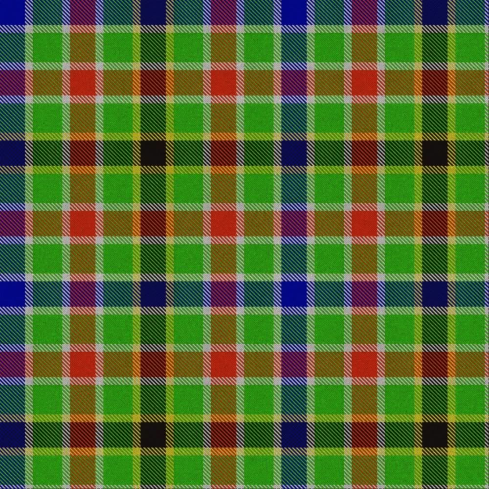
Spirit of 1994 (tartan colours):
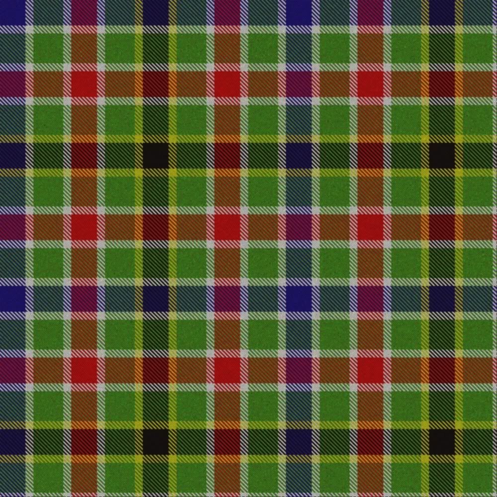
Regards,
Mike
The fear of the Lord is a fountain of life.
[Proverbs 14:27]
-
-
I think it's a tremendous idea Mike. I worked in Zimbabwe for a year in 1997 with blokes from nine different Southern African countries and it seemed the whole of the region was filled of hope for the future, following South Africa's lead in 1994 so the name I think, is spot on!
Of all your designs I like your first one best. I like the uneven spacing more than the other two and I think it better captures the uniqueness of the flag. I agree the tartan should be filled with vibrant colours as I think that's the point.
Press on Sir and good luck with this. Official recognition may be just around the corner.
P.S. I watched the '97 Lions Tour in Pubs in Nyanga (Zim) and Harare. I was vastly outnumbered but man! What a blast! 
-
-
29th May 11, 01:37 PM
#10
The last two designs look to me like simple tweed "gun club" checks. I encourage you to vary the relative thicknesses of the stripes if the point is to make a tartan. As far as the particular colors, I wouldn't get so hung up on that, either. Tartan colors are usually left to the weaver (or whoever commissions the tartan) and are best left IMO in normal threadcount descriptors- Blue, Red, Black, Azure, Green, etc. Being too picky about colors will get in the way of a really nice design.
Although many may dislike the American Bicentennial tartan for it's bright colors, it shows how one can draw inspiration from a flag yet still create an interesting design:

-
Similar Threads
-
By McElmurry in forum The Library
Replies: 2
Last Post: 7th April 11, 03:17 PM
-
By beloitpiper in forum General Celtic Music Talk
Replies: 8
Last Post: 11th December 07, 06:40 AM
-
By Kiltferone in forum Show us your pics
Replies: 21
Last Post: 26th November 07, 06:40 AM
-
By cessna152towser in forum Show us your pics
Replies: 5
Last Post: 24th July 06, 03:49 AM
-
By cessna152towser in forum Show us your pics
Replies: 13
Last Post: 27th June 06, 01:06 AM
 Posting Permissions
- You may not post new threads
- You may not post replies
- You may not post attachments
- You may not edit your posts
-
Forum Rules
|
|


Bookmarks